Get Inspired by These Creative CSS Buttons - ByteScout
  • Home
  • /
  • Blog
  • /
  • Get Inspired by These Creative CSS Buttons

Get Inspired by These Creative CSS Buttons

So, you want to create a catchy button using only HTML and CSS. As you will see in this article this is very achievable using these tools. In earlier days developers used to achieve such a style using other components like Flash which was proprietary and involved enabling a plugin at the client, besides that it was much slower while displaying.

The main idea behind these new CSS styles is the latest updates to CSS and HTML 5.

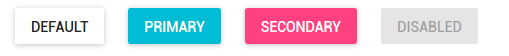
When designing your new cool CSS button you can begin examining two dimensions: button category and button states.

In UX lingo, buttons are categorized into these categories:

Raised Buttons

Typically rectangular buttons with a slight shadow. Raised buttons add dimension to mostly flat layouts. Use them to give more prominence to actions in layouts with a lot of varying content. Raised buttons lift and fill with color on pressing them.

Raised Buttons CSS

Flat Buttons

Flat buttons do not lift but fill with color on press. They are used to minimize distraction from content. They are used mainly in dialogs to blend more naturally with the rest of the dialog.
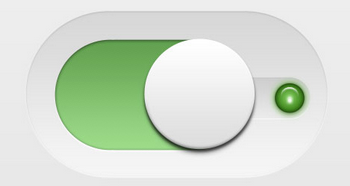
Flat Buttons CSS

Toggle Buttons

Mainly used to represent ON/OFF options for a setting.

Toggle Buttons CSSToggle Button CSS

Ghost Buttons

These are transparent and empty buttons that have a basic shape form such as rectangular. They are bordered by a very thin line and have the internal section being plain text. They are used to lead to secondary content.

Ghost Buttons CSS 

Floating Action Buttons

Part of the Google Material Design guidelines, these buttons lift and display an ink reaction on the press. They are placed as circle icon that floats above the page content and has behaviors that include morphing, launching, and a transferring anchor point.

Action Buttons CSS

Next, you will need to consider what button states you want to support your button.

Creative CSS button states:

  • Normal State: the basic state for the button when it is available to be pressed. The main rule is to make sure the button gives a hint that it is clickable in this state, such as the shadow for raised buttons.
  • Focused State: this happens when hovering over the button. It offers a good visual feedback to the user and a confirmation that the button is ready to accept user action. The examples in this article will focus on this state and the Pressed state.
  • Pressed State: This is the core state of the button that confirms to the user that it was pressed. It can consist of an animation that extends the hover animation or a completely different animation.
  • Inactive State: this is when the button action is not applicable to the current state of the application. It can be implemented by either making it disabled or hide it altogether.

In this article, we will examine how we can implement these types/behaviors using CSS.

CSS animations facilitate the implementation of the “Focused” and “Pressed” states of buttons as described above. Highlighting the state of a button implements the Feedback principle which is highly recommended as one of the 5 Interaction Design principles. Those principles are namely that a good interaction design is Consistent, Visible, Learnable, Predictable, and Provides Feedback.

Feedback is important because it answers the following questions which the human brain asks instinctively:

  • Location: Where am I?
  • Current Status: What’s happening — and is it still happening?
  • Future Status: What will happen next?
  • Outcomes & Results: What just happened?

The CSS features used to build these animations are CSS transitions, CSS button animations, and in some cases, we can use Javascript to add or remove effect classes.

Dimensions of CSS transitions:

  • Which properties to animate: list them explicitly
  • When will the animation start: specify a delay
  • How long the transition will last: set the duration
  • How the transition will run: defined by a timing function (ex. linearly/quick at the beginning and slow at the end/ etc…)

Another CSS feature used to handle the user action of hovering over the button is the “hover” feature. We will group all these concepts in the two cool CSS buttons samples below.

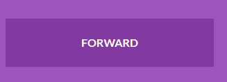
Sample 1: Direction buttons that actually show the direction

This sample demonstrates the use of hover and transitions to reach the desired effect (click on the text block to expand it). For example, the arrow sign replaces the “FORWARD” text coming from the left.

Direction Button CSS Direction Buttons CSS

<head>
<img src="data:image/gif;base64,R0lGODlhAQABAIAAAAAAAP///yH5BAEAAAAALAAAAAABAAEAAAIBRAA7" data-wp-preserve="%3Cstyle%3E%0A%0A%40import%20url(https%3A%2F%2Ffonts.googleapis.com%2Fcss%3Ffamily%3DLato%3A300%2C400%2C700)%3B%0A%0A%26nbsp%3B%0A%0A%3A%3A-moz-focus-inner%20%7B%0A%0Aborder%3A0%3B%0A%0A%7D%0A%0A%26nbsp%3B%0A%0A*%20%7B%0A%0Amargin%3A%200%3B%0A%0Apadding%3A%200%3B%0A%0Aborder%3A%200%3B%0A%0A%7D%0A%0A%26nbsp%3B%0A%0Abody%20%7B%0A%0Afont-family%3A%20'Lato'%2C%20Calibri%2C%20Arial%2C%20sans-serif%3B%0A%0Afont-weight%3A%20bold%3B%0A%0Acolor%3A%20%23fff%3B%0A%0Abackground%3A%20%239e54bd%3B%0A%0A%7D%0A%0A%23wrapper%20%7B%0A%0Awidth%3A%20800px%3B%0A%0Amargin%3A%2020px%20auto%3B%0A%0A%7D%0A%0A%26nbsp%3B%0A%0Abutton%20%7B%0A%0Afont%3A%20inherit%3B%0A%0Acolor%3A%20inherit%3B%0A%0Awidth%3A%20300px%3B%0A%0Atext-transform%3A%20uppercase%3B%0A%0Apadding%3A%2025px%2080px%3B%0A%0Amargin%3A%2015px%2030px%3B%0A%0Abackground%3A%20%23823aa0%3B%0A%0Aoverflow%3A%20hidden%3B%0A%0Aposition%3A%20relative%3B%0A%0A%7D%0A%0Abutton%3Abefore%20%7B%0A%0Aleft%3A%2048%25%3B%0A%0A%7D%0A%0Abutton%3Aactive%20%7B%0A%0Abackground%3A%20%239053a9%3B%0A%0Acolor%3A%20%23823aa0%3B%0A%0Atop%3A%202px%3B%0A%0A%7D%0A%0Abutton%20%3E%20span%20%7B%0A%0Adisplay%3A%20inline-block%3B%0A%0Atransition%3A%20all%200.5s%3B%0A%0A%7D%0A%0A.icon-forward%3Abefore%20%7B%0A%0Acontent%3A%20%22%5C2192%22%3B%0A%0Aposition%3A%20absolute%3B%0A%0A%7D%0A%0A.icon-backward%3Abefore%20%7B%0A%0Acontent%3A%20%22%5C2190%22%3B%0A%0Aposition%3A%20absolute%3B%0A%0A%7D%0A%0A.icon-up%3Abefore%20%7B%0A%0Acontent%3A%20%22%5C2191%22%3B%0A%0Aposition%3A%20absolute%3B%0A%0A%7D%0A%0A.icon-down%3Abefore%20%7B%0A%0Acontent%3A%20%22%5C2193%22%3B%0A%0Aposition%3A%20absolute%3B%0A%0A%7D%0A%0A.btn-1%3Abefore%20%7B%0A%0Aleft%3A%20-100%25%3B%0A%0Atransition%3A%20all%200.5s%3B%0A%0A%7D%0A%0A.btn-1%3Ahover%3Abefore%20%7B%0A%0Aleft%3A%2048%25%3B%0A%0A%7D%0A%0A.btn-1%3Ahover%20%3E%20span%20%7B%0A%0Atransform%3A%20translateX(300%25)%3B%0A%0A%7D%0A%0A.btn-2%3Abefore%20%7B%0A%0Atop%3A%20-100%25%3B%0A%0Atransition%3A%20all%200.5s%3B%0A%0A%7D%0A%0A.btn-2%3Ahover%3Abefore%20%7B%0A%0Atop%3A%2030%25%3B%0A%0A%7D%0A%0A.btn-2%3Ahover%20%3E%20span%20%7B%0A%0Atransform%3A%20translateY(300%25)%3B%0A%0A%7D%0A%0A%3C%2Fstyle%3E" data-mce-resize="false" data-mce-placeholder="1" class="mce-object" width="20" height="20" alt="&lt;style&gt;" title="&lt;style&gt;" />
</head>
&nbsp;
<div id="wrapper">
<button class="btn-1 icon-forward"><span>Forward</span></button>
<button class="btn-1 icon-backward"><span>Backward</span></button>
<button class="btn-2 icon-up"><span>Upward</span></button>
<button class="btn-2 icon-down"><span>Downward</span></button>
</div>

In this sample we make use of the following CSS classes:

  • before:

This is a pseudo-element that we use to reach various goals depending on the elements inside it.

First of all, we use “before” to prepare the characters that appear on the hover action. You can replace these characters with an image of your choice. For this demo purposes, we just use the arrow characters encoded appropriately in CSS in the “content” property.

.icon-forward:before {
content: "\2192";
position: absolute;
}
.icon-backward:before {
content: "\2190";
position: absolute;
}

For example, to hide the left and right arrows before making the animation in Forward and Backward buttons we do the following:

.btn-1:before {
left: -100%;
transition: all 0.5s;
}

You will notice that both Forward and Backward buttons are replaced by an arrow character that comes from the left. This is because they both use the same “.btn-1” class which has the “left” property set to -100%. The negative sign combined with the transition property implies that the animation happens from left to right. This is built on a coordinate system that considers the corner of the element as the 0 points, so any negative value will imply the left of the element.

You can experiment with the 100% value or you can change the negative sign to no sign (i.e. positive) to see this in effect. For example, changing it to 150% makes the icon appear from the right.

As described earlier, the “transition” element here defines which property to animate: “all”, and how long the transition will last “0.5s”.

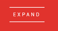
Sample 2: sideways expansion hover

This sample animates the Focused state by simulating that the button expands to the left and right, offering a pleasant experience to the user.

Expand Buttons CSS Expand Button CSS

<head>
<img src="data:image/gif;base64,R0lGODlhAQABAIAAAAAAAP///yH5BAEAAAAALAAAAAABAAEAAAIBRAA7" data-wp-preserve="%3Cscript%20src%3D%22https%3A%2F%2Fcdnjs.cloudflare.com%2Fajax%2Flibs%2Fmodernizr%2F2.8.3%2Fmodernizr.min.js%22%20type%3D%22text%2Fjavascript%22%3E%3C%2Fscript%3E" data-mce-resize="false" data-mce-placeholder="1" class="mce-object" width="20" height="20" alt="&lt;script&gt;" title="&lt;script&gt;" />
&nbsp;
<img src="data:image/gif;base64,R0lGODlhAQABAIAAAAAAAP///yH5BAEAAAAALAAAAAABAAEAAAIBRAA7" data-wp-preserve="%3Cstyle%3E%0A%0A%40import%20url(https%3A%2F%2Ffonts.googleapis.com%2Fcss%3Ffamily%3DRoboto%3A400%2C100%2C900)%3B%0A%0A*%20%7B%0A%0Abox-sizing%3A%20inherit%3B%0A%0Atransition-property%3A%20all%3B%0A%0Atransition-duration%3A%20.6s%3B%0A%0Atransition-timing-function%3A%20ease%3B%0A%0A%7D%0A%0A%26nbsp%3B%0A%0Ahtml%2C%0A%0Abody%20%7B%0A%0Abox-sizing%3A%20border-box%3B%0A%0Aheight%3A%20100%25%3B%0A%0Awidth%3A%20100%25%3B%0A%0A%7D%0A%0A%26nbsp%3B%0A%0Abody%20%7B%0A%0Abackground%3A%20%23E1332D%3B%0A%0Afont-family%3A%20'Roboto'%2C%20sans-serif%3B%0A%0Afont-weight%3A%20400%3B%0A%0A%7D%0A%0A%26nbsp%3B%0A%0A.buttons%20%7B%0A%0Adisplay%3A%20flex%3B%0A%0Aflex-direction%3A%20column%3B%0A%0Aheight%3A%20100%25%3B%0A%0Ajustify-content%3A%20center%3B%0A%0Atext-align%3A%20center%3B%0A%0Awidth%3A%20100%25%3B%0A%0A%7D%0A%0A%26nbsp%3B%0A%0A.container%20%7B%0A%0Aalign-items%3A%20center%3B%0A%0Adisplay%3A%20flex%3B%0A%0Aflex-direction%3A%20column%3B%0A%0Ajustify-content%3A%20center%3B%0A%0Apadding%3A%201em%3B%0A%0Atext-align%3A%20center%3B%0A%0A%7D%0A%0A%40media%20(min-width%3A%20600px)%20%7B%0A%0A.container%20%7B%0A%0Aflex-direction%3A%20row%3B%0A%0Ajustify-content%3A%20space-between%3B%0A%0A%7D%0A%0A%7D%0A%0A%26nbsp%3B%0A%0Ah1%20%7B%0A%0Acolor%3A%20%23fff%3B%0A%0Afont-size%3A%201.25em%3B%0A%0Afont-weight%3A%20900%3B%0A%0Amargin%3A%200%200%202em%3B%0A%0A%7D%0A%0A%40media%20(min-width%3A%20450px)%20%7B%0A%0Ah1%20%7B%0A%0Afont-size%3A%201.75em%3B%0A%0A%7D%0A%0A%7D%0A%0A%40media%20(min-width%3A%20760px)%20%7B%0A%0Ah1%20%7B%0A%0Afont-size%3A%203.25em%3B%0A%0A%7D%0A%0A%7D%0A%0A%40media%20(min-width%3A%20900px)%20%7B%0A%0Ah1%20%7B%0A%0Afont-size%3A%205.25em%3B%0A%0Amargin%3A%200%200%201em%3B%0A%0A%7D%0A%0A%7D%0A%0A%26nbsp%3B%0A%0Ap%20%7B%0A%0Acolor%3A%20%23fff%3B%0A%0Afont-size%3A%2012px%3B%0A%0A%7D%0A%0A%40media%20(min-width%3A%20600px)%20%7B%0A%0Ap%20%7B%0A%0Aleft%3A%2050%25%3B%0A%0Aposition%3A%20absolute%3B%0A%0A-webkit-transform%3A%20translate(-50%25%2C%200)%3B%0A%0Atransform%3A%20translate(-50%25%2C%200)%3B%0A%0Atop%3A%2090%25%3B%0A%0A%7D%0A%0A%7D%0A%0A%40media%20(max-height%3A%20500px)%20%7B%0A%0Ap%20%7B%0A%0Aleft%3A%200%3B%0A%0Aposition%3A%20relative%3B%0A%0Atop%3A%200%3B%0A%0A-webkit-transform%3A%20translate(0%2C%200)%3B%0A%0Atransform%3A%20translate(0%2C%200)%3B%0A%0A%7D%0A%0A%7D%0A%0Ap%20a%20%7B%0A%0Abackground%3A%20rgba(255%2C%20255%2C%20255%2C%200)%3B%0A%0Aborder-bottom%3A%201px%20solid%3B%0A%0Acolor%3A%20%23fff%3B%0A%0Aline-height%3A%201.4%3B%0A%0Apadding%3A%20.25em%3B%0A%0Atext-decoration%3A%20none%3B%0A%0A%7D%0A%0Ap%20a%3Ahover%20%7B%0A%0Abackground%3A%20white%3B%0A%0Acolor%3A%20%23E1332D%3B%0A%0A%7D%0A%0A%26nbsp%3B%0A%0A.btn%20%7B%0A%0Acolor%3A%20%23fff%3B%0A%0Acursor%3A%20pointer%3B%0A%0Afont-size%3A%2016px%3B%0A%0Afont-weight%3A%20400%3B%0A%0Aline-height%3A%2045px%3B%0A%0Amargin%3A%200%200%202em%3B%0A%0Amax-width%3A%20160px%3B%0A%0Aposition%3A%20relative%3B%0A%0Atext-decoration%3A%20none%3B%0A%0Atext-transform%3A%20uppercase%3B%0A%0Awidth%3A%20100%25%3B%0A%0A%7D%0A%0A%40media%20(min-width%3A%20600px)%20%7B%0A%0A.btn%20%7B%0A%0Amargin%3A%200%201em%202em%3B%0A%0A%7D%0A%0A%7D%0A%0A.btn%3Ahover%20%7B%0A%0Atext-decoration%3A%20none%3B%0A%0A%7D%0A%0A%26nbsp%3B%0A%0A.btn-2%20%7B%0A%0Aletter-spacing%3A%200%3B%0A%0A%7D%0A%0A%26nbsp%3B%0A%0A.btn-2%3Ahover%2C%0A%0A.btn-2%3Aactive%20%7B%0A%0Aletter-spacing%3A%205px%3B%0A%0A%7D%0A%0A%26nbsp%3B%0A%0A.btn-2%3Aafter%2C%0A%0A.btn-2%3Abefore%20%7B%0A%0A-webkit-backface-visibility%3A%20hidden%3B%0A%0Abackface-visibility%3A%20hidden%3B%0A%0Aborder%3A%201px%20solid%20rgba(255%2C%20255%2C%20255%2C%200)%3B%0A%0Abottom%3A%200px%3B%0A%0Acontent%3A%20%22%20%22%3B%0A%0Adisplay%3A%20block%3B%0A%0Amargin%3A%200%20auto%3B%0A%0Aposition%3A%20relative%3B%0A%0Atransition%3A%20all%20280ms%20ease-in-out%3B%0A%0Awidth%3A%200%3B%0A%0A%7D%0A%0A%26nbsp%3B%0A%0A.btn-2%3Ahover%3Aafter%2C%0A%0A.btn-2%3Ahover%3Abefore%20%7B%0A%0A-webkit-backface-visibility%3A%20hidden%3B%0A%0Abackface-visibility%3A%20hidden%3B%0A%0Aborder-color%3A%20%23fff%3B%0A%0Atransition%3A%20width%20350ms%20ease-in-out%3B%0A%0Awidth%3A%2070%25%3B%0A%0A%7D%0A%0A%26nbsp%3B%0A%0A.btn-2%3Ahover%3Abefore%20%7B%0A%0Abottom%3A%20auto%3B%0A%0Atop%3A%200%3B%0A%0Awidth%3A%2070%25%3B%0A%0A%7D%0A%0A%3C%2Fstyle%3E" data-mce-resize="false" data-mce-placeholder="1" class="mce-object" width="20" height="20" alt="&lt;style&gt;" title="&lt;style&gt;" />
</head>
&nbsp;
<body>
<section class="buttons">
<h1>Button Hover Effects</h1>
<div class="container">
&nbsp;
<a href="#" class="btn btn-1">
<svg>
<rect x="0" y="0" fill="none" width="100%" height="100%" />
</svg>
Hover
</a>
&nbsp;
<a href="#" class="btn btn-2">Hover</a>
<!--End of Button 2 -->
&nbsp;
<a href="#" class="btn btn-3">Hover</a>
<!--End of Button 3 -->
&nbsp;
<a href="#" class="btn btn-4">
<span>Hover</span>
</a>
<!--End of Button 4 -->
&nbsp;
<a href="#" class="btn btn-5">Hover</a>
<!--End of Button 5 -->
&nbsp;
</div>
</section>
<img src="data:image/gif;base64,R0lGODlhAQABAIAAAAAAAP///yH5BAEAAAAALAAAAAABAAEAAAIBRAA7" data-wp-preserve="%3Cscript%20src%3D'http%3A%2F%2Fcdnjs.cloudflare.com%2Fajax%2Flibs%2Fjquery%2F2.1.3%2Fjquery.min.js'%3E%3C%2Fscript%3E" data-mce-resize="false" data-mce-placeholder="1" class="mce-object" width="20" height="20" alt="&lt;script&gt;" title="&lt;script&gt;" />
&nbsp;
</body>

This section helps make the text transition smooth, if you omit it you will notice that the text jumps from the non-expanded state to the expanded state in a brisk fashion.

@import url(https://fonts.googleapis.com/css?family=Roboto:400,100,900);
* {
box-sizing: inherit;
transition-property: all;
transition-duration: .6s;
transition-timing-function: ease;
}

Then to control the original drawing of the bounding box we use this section.

.btn-2:after,
.btn-2:before {
-webkit-backface-visibility: hidden;
backface-visibility: hidden;
border: 1px solid rgba(255, 255, 255, 0);
bottom: 0px;
content: " ";
display: block;
margin: 0 auto;
position: relative;
transition: all 280ms ease-in-out;
width: 0;
}

Adding to that we use the following section for the upper border.

/* upper line */
.btn-2:hover:after,
.btn-2:hover:before {
-webkit-backface-visibility: hidden;
backface-visibility: hidden;
border-color: #fff;
transition: width 350ms ease-in-out;
width: 70%;
}

And to control the lower border we use this transition.

/* lower line */
.btn-2:hover:before {
bottom: auto;
top: 0;
width: 70%;
}

As we have seen in the two samples, the CSS transition element proves to be a very powerful tool to implement CSS button animation. This article was an introduction to the various concepts you need to consider when designing a new button animation and we also provided a hint of how to reach the desired animation using CSS.


About the Author

ByteScout Team ByteScout Team of Writers ByteScout has a team of professional writers proficient in different technical topics. We select the best writers to cover interesting and trending topics for our readers. We love developers and we hope our articles help you learn about programming and programmers.  
prev
next