Our ByteScout SDK products are sunsetting as we focus on expanding new solutions.
Learn More
Important Update
ByteScout SDK Sunsetting Notice
Our ByteScout SDK products are sunsetting as we focus on our new & improved solutions.Thank you for being part of our journey, and we look forward to supporting you in this next chapter!
The users can use Excel for multiple purposes, including logging data in raw format, recording data in experiments, and logging the organization’s data that contains expenses, production, arrears, or any numerical value that needs to be recorded. There are many datasets, and the users need to filter them to understand them. Pivot tables come in handy while working with various data sets. A Pivot table is a powerful feature of Excel that helps extract information from a detailed dataset.
Pivot tables are used where users must show a numerical sum of values for a certain amount of data to summarize the data to see comparisons, trends, and patterns. To understand pivot tables, first, it is important to understand the terms used in pivot tables. The main terms used when dealing with pivot tables are:
Rows: Rows point to data taken to specify the table.
Values: Values point to the data count displayed after the specified condition.
Filters: Filters help hide or show specified data in the table.
Columns: Columns are the values that are shown under specified conditions
Creating a Pivot Table in Excel
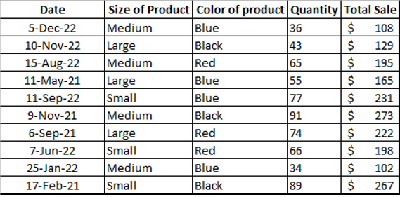
1. Users can create a pivot table by creating a new blank Excel file and entering their raw data in Excel, or they can use an existing Excel workbook containing data that needs summarization. For this example, the following table contains the data related to the specifications of a product, like its size, color, quantity, and sale.
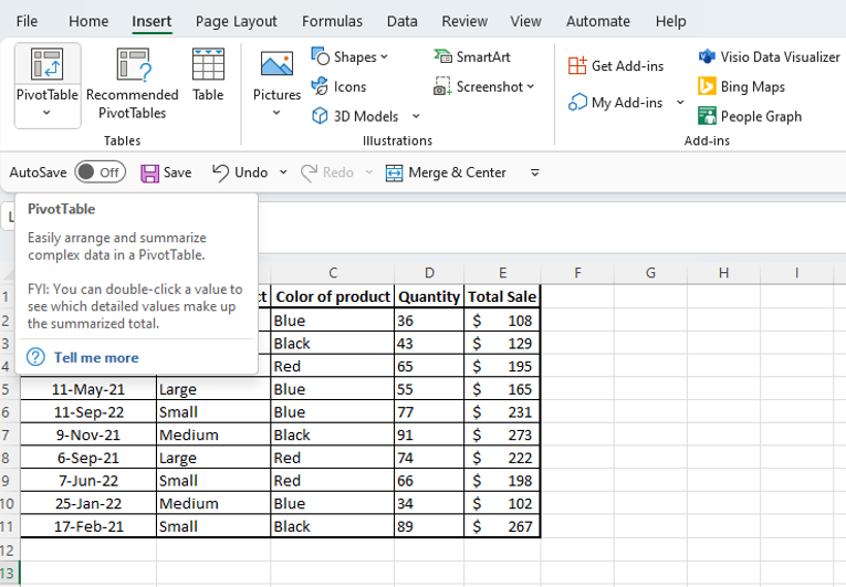
2. The first step is to select the data to create a sample pivot table. The user has to navigate to the Insert tab and select the Pivot Table option from the bar.
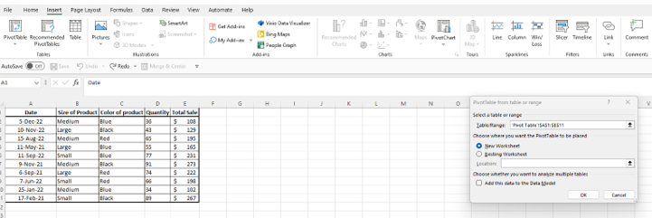
3. A pop-up appears after selecting the Pivot Table option, which indicates where to place the Pivot Table.
4. The users have two options to select from. They can select to create the Pivot table in the new workbook or place it in the existing worksheet. For this example, the new workbook is selected.
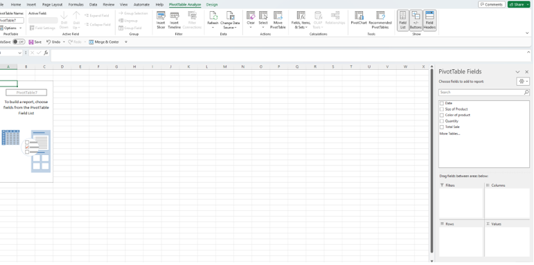
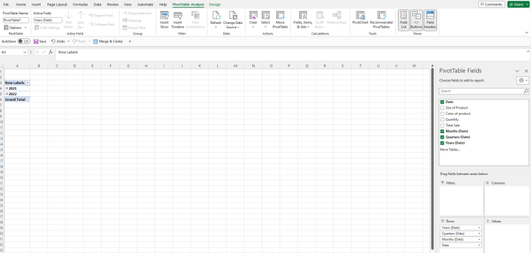
5. The users can see the Pivot table fields on the right-side panel. The panel contains the options from the original table, and the users can select any of these, and that section will populate here.
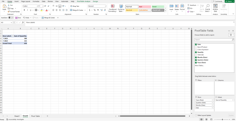
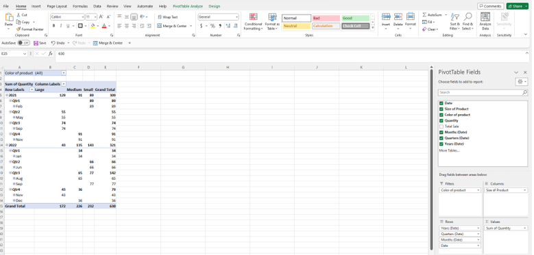
6. The users can now select the value to be displayed against these dates. For example, if the user selects the Quantity field, the table displays the sum of quantities sold in that particular year before that row. In the following table, the quantity is displayed for every year.
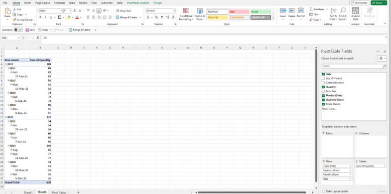
7. The users can expand the particular year by clicking on the “+” button next to that year. It displays the quarterly information and the quantities sold in each quarter. The users can also expand the Quarters to see the monthly information and further expand the Months to see the daily information. This approach helps in visualizing all the sales information.
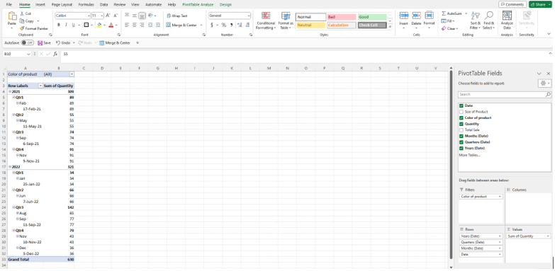
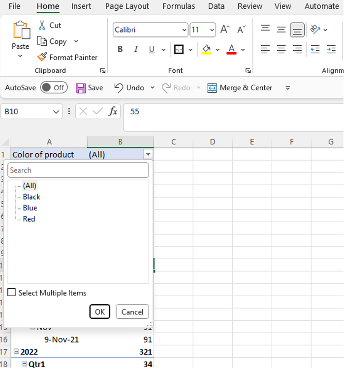
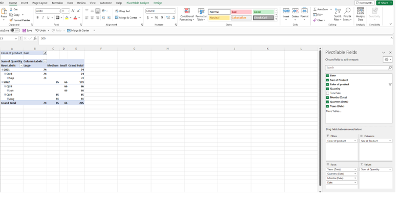
8. The user can also apply filters on the specific data to display the required information. For this purpose, the user must drag the value from the above fields section and drop them in the Filters section. For example, if the user drags the color of the product field in the filter section, the table displays the data against that color. This approach helps determine the sale of a product based on that particular color. The user can see the product’s color on top of the Pivot table.
9. If the user wants to filter a certain color, they can change the option from All to that color. For example, the user selects Red color. Now the table displays all data against the color Red including the information for every year, quarter, and month.
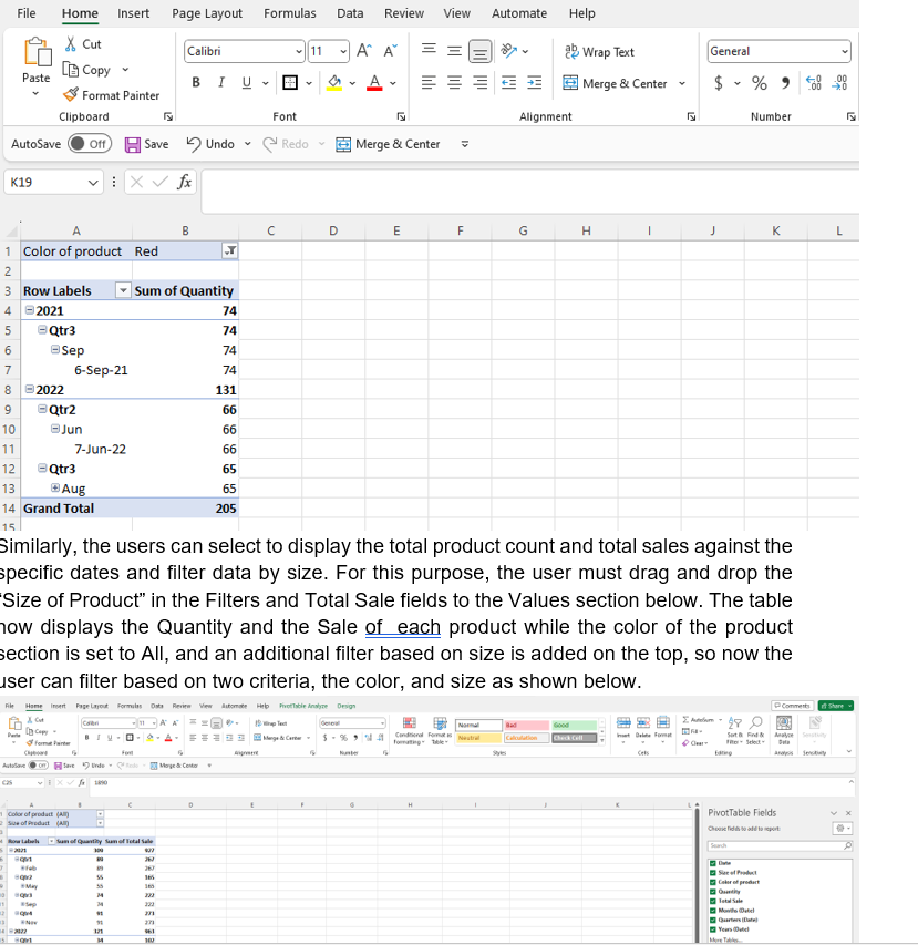
10. The table displays the data against the Red color as per the below screenshot.
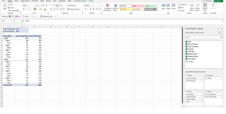
11. Similarly, the users can select to display the total product count and total sales against the specific dates and filter data by size. For this purpose, the user must drag and drop the “Size of Product” in the Filters and Total Sale fields to the Values section below. The table now displays the Quantity and the Sale of each product while the color of the product section is set to All, and an additional filter based on size is added on the top, so now the user can filter based on two criteria, the color, and size as shown below.
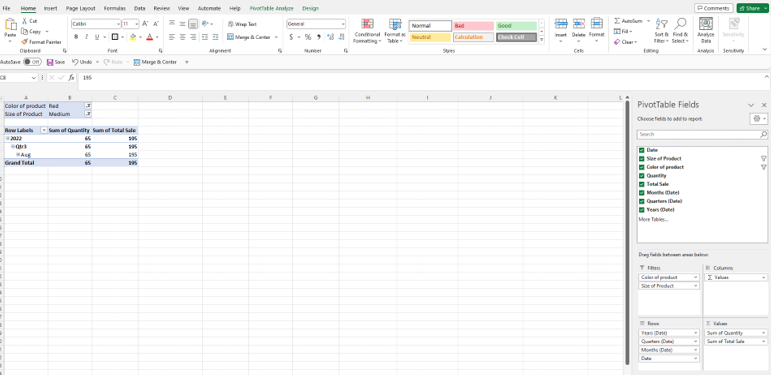
12. If the user wants to view the values against a specific product’s color, they can use the already applied filter from the above section and choose a particular color from the filter that was applied earlier. The user must select the color from the top of the pivot table to display specific data based on the color. Similarly, they can filter the data based on the size as well. In this example, the color red with the size medium is selected to show the sale of medium-sized red color products.
13. If the user wants to see the product count against each size and the corresponding dates, they must drag and drop the “size of product” to the Columns section and remove the Values field, which the tool added as default.
14. Similarly, a filter on top can be applied for further filtering based on colors. In this example, the Red color is selected to show the respective data.
In a nutshell, the Pivot Tables in Excel play an important role in visualizing huge data sets. It is a very powerful tool in terms of reporting and data analytics. Users can use this tool for multiple purposes, including analysis of huge amounts of data that usually need days to process manually. The key to using pivot tables effectively is to use the right pivot table and clarify the base requirement. The above example represents an organization’s data selling products of different sizes and colors. Using the Pivot table practice, the management can monitor the most trending products and summarize the revenue generated against specific products.
The key advantage of the Pivot tables is that they can automatically update the reports when the data tables are updated. They improve data accuracy and provide the ability to create interactive dashboards.
About the Author
ByteScout Team of WritersByteScout has a team of professional writers proficient in different technical topics. We select the best writers to cover interesting and trending topics for our readers. We love developers and we hope our articles help you learn about programming and programmers.
Increased adoption of the robotics process automation is turning heads. The emerging technology, although not new, is increasingly garnering attention from both individuals and organizations....