Our ByteScout SDK products are sunsetting as we focus on expanding new solutions.
Learn More
Important Update
ByteScout SDK Sunsetting Notice
Our ByteScout SDK products are sunsetting as we focus on our new & improved solutions.Thank you for being part of our journey, and we look forward to supporting you in this next chapter!
Dark mode in mobile apps is a popular feature nowadays. The latest versions of operating systems running on mobile devices are readily supporting dark mode incorporation. Dark mode themes not only provides a distinct visual impact but also aids human vision and device energy. Dark themes are proven to reduce eye strain on low-lighting conditions. It also reduces the brightness scope. Thus, decreasing overall power consumption on the device. Hence, the Dark mode feature in a mobile application can be an essential element today.
Summary
This tutorial will shed light on how to integrate dark mode themes into the Flutter app interface without using any third-party libraries. The idea is to start with creating a basic UI containing text, buttons, and text fields. Then, we will apply a switch mechanism to handle the switching of theme modes. Most importantly, we are going to set the theme properties using ThemeData class. Lastly, apply the theme property to our Material App thus reflecting on the entire widget tree.
Create a new Flutter project
First, we need to create a new Flutter project. For that, make sure that the Flutter SDK and other flutter app development related requirements are properly installed. If everything is properly set up, then in order to create a project, we can simply run the following command in the desired local directory:
flutter create customFontExample
After the project has been set up, we can navigate inside the project directory and execute the following command in the terminal to run the project in either an available emulator or an actual device:
flutter run
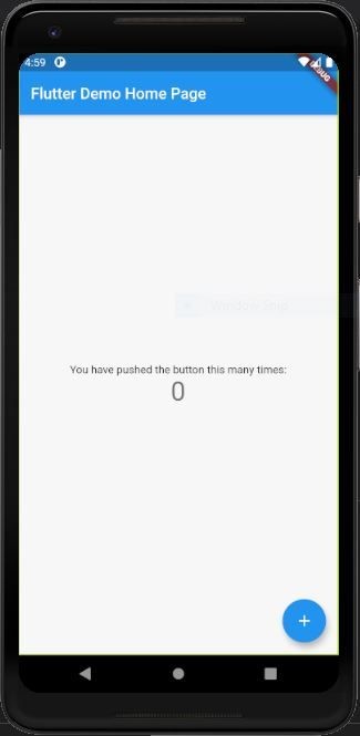
After successfully build, we will get the following result on the emulator screen:
Creating a Simple template
Now, we are going to create a simple main screen template in order to capture the influence of dark mode on different UI widgets of Flutter.
For that, we need to remove the default MyApp stateless widget as well as the HomePageState stateful widget from the main.dart file.
Instead, we are going to add a new App class extending to the Stateful widget which is to be called in the main() function inside the runApp method. The basic scaffolding is provided in the code snippet below:
Here, we have returned the MaterialApp widget as the primary parent widget from the AppState class which contains the Scaffold widget as a child. In the Scaffold widget, we have added a basic AppBar and Container widget as a body.
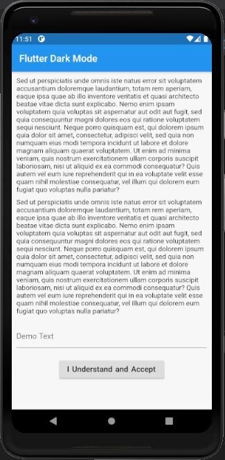
Creating Scaffold Body Template
Now, we are going to work on creating the Scaffold body. Here, we are going to add some Text widgets, a button, and an input field so that, we can see what becomes of them when we switch the app themes. The overall coding implementation is provided in the code snippet below:
body: Container(
          padding: EdgeInsets.all(10),
          child: SingleChildScrollView(
            child: Column(
              mainAxisAlignment: MainAxisAlignment.center,
              children: [
                Text("Sed ut perspiciatis unde omnis iste natus error sit voluptatem accusantium doloremque laudantium, totam rem aperiam, eaque ipsa quae ab illo inventore veritatis et quasi architecto beatae vitae dicta sunt explicabo. Nemo enim ipsam voluptatem quia voluptas sit aspernatur aut odit aut fugit, sed quia consequuntur magni dolores eos qui ratione voluptatem sequi nesciunt. Neque porro quisquam est, qui dolorem ipsum quia dolor sit amet, consectetur, adipisci velit, sed quia non numquam eius modi tempora incidunt ut labore et dolore magnam aliquam quaerat voluptatem. Ut enim ad minima veniam, quis nostrum exercitationem ullam corporis suscipit laboriosam, nisi ut aliquid ex ea commodi consequatur? Quis autem vel eum iure reprehenderit qui in ea voluptate velit esse quam nihil molestiae consequatur, vel illum qui dolorem eum fugiat quo voluptas nulla pariatur?"),
                SizedBox(height: 10,),
                Text("Sed ut perspiciatis unde omnis iste natus error sit voluptatem accusantium doloremque laudantium, totam rem aperiam, eaque ipsa quae ab illo inventore veritatis et quasi architecto beatae vitae dicta sunt explicabo. Nemo enim ipsam voluptatem quia voluptas sit aspernatur aut odit aut fugit, sed quia consequuntur magni dolores eos qui ratione voluptatem sequi nesciunt. Neque porro quisquam est, qui dolorem ipsum quia dolor sit amet, consectetur, adipisci velit, sed quia non numquam eius modi tempora incidunt ut labore et dolore magnam aliquam quaerat voluptatem. Ut enim ad minima veniam, quis nostrum exercitationem ullam corporis suscipit laboriosam, nisi ut aliquid ex ea commodi consequatur? Quis autem vel eum iure reprehenderit qui in ea voluptate velit esse quam nihil molestiae consequatur, vel illum qui dolorem eum fugiat quo voluptas nulla pariatur?"),

                SizedBox(height : 20),
                TextField(
                  controller: controller,
                  decoration: InputDecoration(
                    hintText: "Demo Text",
                  ),
                ),
                SizedBox(height : 20),
                RaisedButton(
                  onPressed: () {  },
                  child: Text("I Understand and Accept", style: TextStyle(fontSize: 16, wordSpacing: 2),),
                ),
                SizedBox(height : 50)
              ],
            ),
          ),
        ),
      ),
Here, we have some Text widgets, a RaisedButton, and a TextField. Moreover, we have used the Column widget to structure other widgets vertically on the screen.
Hence, the result is shown in the emulator screenshot below:
Adding Theme changer Switch to App Bar
Now, we are going to add a Switch widget through which we will control the theme changes in the app. But first, we need to define a Boolean state variable that controls the value of the switch whether the switch is ON or OFF. Here, we are going to define it as darkModeActive which is initialized to false as shown in the code snippet below:
bool darkModeActive = false;
Next, we are going to add the Switch widget at the right end of the App bar using the actions property provided by the AppBar widget:
Here, flicking the switch On/Off will trigger the onChanged event which will assign a toggle value to our darkModeActive state. The setState() method is used to re-render the whole widget tree so that the changes to the app display reflect on the screen. The value property in the Switch widget reflects the value of the darkModeActive state.
Thus, the idea is to change the theme to dark when darkModeActive state is true and to the light mode when darkModeActive is false.
Define Theme Properties for Dark Mode and Light Mode
This step is the major step in which we are going to define our theme properties using the Themedata class object.
The ThemeData class enables us to define the configuration of the overall visual Theme for a MaterialApp or a widget subtree within the app. It lets us define the color properties as well as widget themes for other widgets as well. Once assigned to the theme property of the MaterialApp widget, the properties in the ThemeData class will reflect on the overall app. The light and dark mode theme configuration properties that we are going to use on this app is provided in the code snippet below:
Here, we define the accentColor, brightness, and primaryColor properties for both themes. For dark theme, we define a custom theme for buttons as well using ButtonThemeData class on buttonTheme property. Moreover, we apply custom text themes for both theme modes as well as using TextTheme class.
Most Importantly, the major theme property that provides the dark and light theme appearance is the brightness property.
Note that we can apply any theme configuration properties here. Since the tutorial objective is to deliver the lesson on dark mode, we are going with configurations that reflect the dark mode and light mode.
Applying the Theme properties to our Material App
Finally, the last thing left is to add these theme properties to our MaterialApp. The MaterialApp widget provides a theme property. This theme property allows us to assign the custom theme properties that reflect on the entire app widget tree. Here, we are going the assign the theme properties based on darkModeActive conditional status as shown in the code snippet below:
If the darkModeActive status is false, then we display the light theme else the dark mode.
As we can notice, the theme for text, button, and the Text field also changes along with the entire appearance on the app.
Finally, we have successfully implemented the dark mode in the Flutter environment without using any third-party plugins.
Conclusion
Hope the stepwise guidance provided in this tutorial will make it easy for you to integrate the dark mode feature in Flutter apps. This is not only about implementing the dark and light mode theme but also a custom theme based on the app’s need. The ThemeData class enables us to create just about any style of the theme. Make sure to try out different combinations. This is just a simple implementation to help you with the basics of how to change themes in Flutter. Most importantly, we can even apply different techniques in complex multiple screen apps using Provider or other state managing libraries.
About the Author
ByteScout Team of WritersByteScout has a team of professional writers proficient in different technical topics. We select the best writers to cover interesting and trending topics for our readers. We love developers and we hope our articles help you learn about programming and programmers.
.NET MVC 3 from Microsoft gains more and more popularity for ASP.NET web application development since the first version which was introduced in 2007 but...
PDF tags refer to the structural elements embedded within a PDF document that provides meaningful information about its content. These tags serve a crucial purpose...

 Important Update