Our ByteScout SDK products are sunsetting as we focus on expanding new solutions.
Learn More
Important Update
ByteScout SDK Sunsetting Notice
Our ByteScout SDK products are sunsetting as we focus on our new & improved solutions.Thank you for being part of our journey, and we look forward to supporting you in this next chapter!
The users can use Excel to put together some numeric data and have a better visualization of that data using graphs or charts. Charts or graphs visually represent the relationship between the numeric data. This visual representation, or charts, makes it easier to comprehend the data and helps make essential business decisions.
Types of Charts in Excel
The data tables in Excel vary based on their complexity and size. Therefore, the users prefer a visual representation to comprehend the relationships between the data columns easily. There are numerous types of charts in Excel that provide analysis of the data based on different user requirements. Following are some of the types of charts supported by Excel:
Column Chart
It is based on vertical bars representing the data as vertical bars containing data values. It helps in comparing the information from the different data types.
Pie or Doughnut Chart
It represents the data in a round shape, with data defined as pie slices.
Line Chart
It represents the data in lines that connect the data points. This chart helps in analyzing the trends over time.
Bar Chart
It represents the data through horizontal bars that can work like column charts. Bar charts and column charts are opposites of each other.
Area Chart
It represents the data in the form of lines filled with colors. It is similar to the Line Chart, but the gaps between lines are filled with different colors to differentiate the area. It helps in analyzing the trends for business growth.
Surface Chart
It is a 3D chart that represents the data in the form of a 3D landscape. It is helpful while working with large data sets and helps display various data types in the same model.
This article shows two of the most commonly used chart types with steps to be followed as a sample. The users can apply these examples and steps to any data type and use them according to their requirements.
Creating a Chart or Graph in Excel
Following are the steps to create a meaningful chart or Graph in Excel:
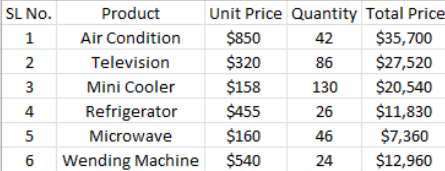
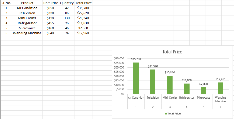
1. Users can create a new blank sheet and enter data in their customized columns. In this example, the following is a data table (shown in the image below) that provides information regarding each product’s sold quantity and total price for a particular month.
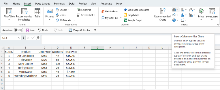
2. After organizing the data in columns, the users have to select the data and click on the Insert tab from the top navigation buttons.
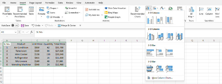
3. After clicking on this column Chart button from the Inset tab, the users can see multiple options to create the chart. There are options like 2-D Column, 3-D Column, 2-D Bar, 3-D Bar, and More Column Charts to customize the chart settings according to user requirements.
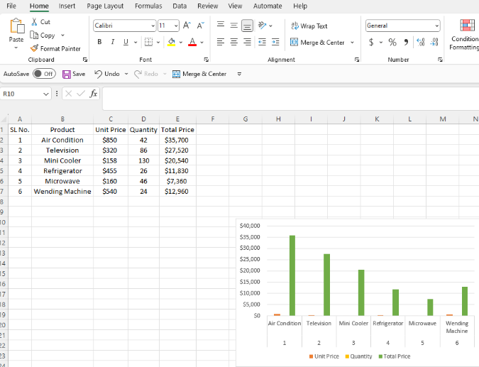
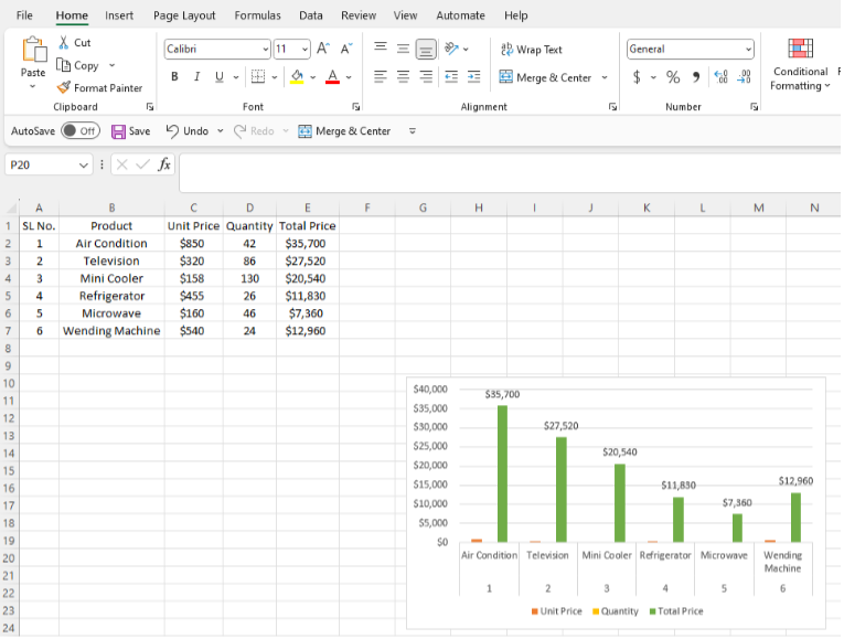
4. The users can hover over any option and get a preview of every chart so they can have an idea bout the chart before creating it. If the user selects the clustered option from the charts menu for this sample data, they will get the following chart type in the worksheet.
5. The above image shows a very basic example of the chart. The users can edit the chart to provide more information to create a meaningful one.
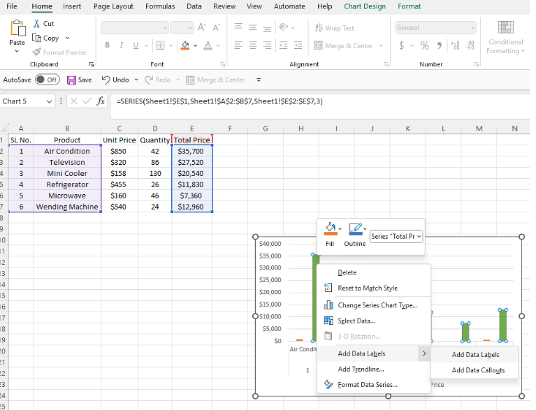
6. The users can customize this chart now. For example, they can add the data labels by right-clicking on each bar and selecting the Add Data Labels option.
7. Now the users can see the data labels against each bar. In this example, the data labels show the Total price of each product against its specific bar.
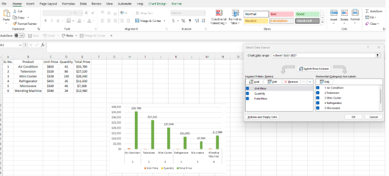
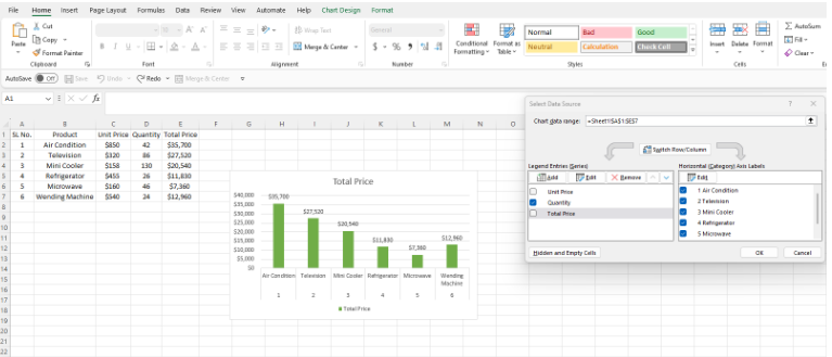
8. The user can edit the table to create a chart of the total sales for a specific product for a particular month. This approach will give the idea of a product’s total sales and help in effective decision-making by getting an overview of monthly sales. For this, the user can select the chart, right-click the chart, and click on the select data option. The user will be able to see a screen like this:
9. Unselect the Unit Price and the Quantity to show only the Total Price against each product for that specific month.
10. Following is the chart of the Total Price of every sold product.
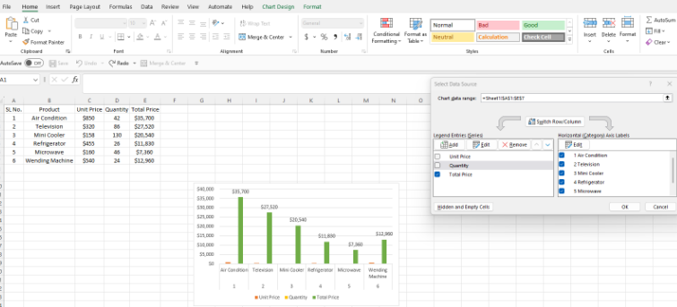
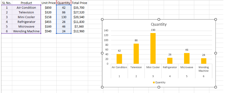
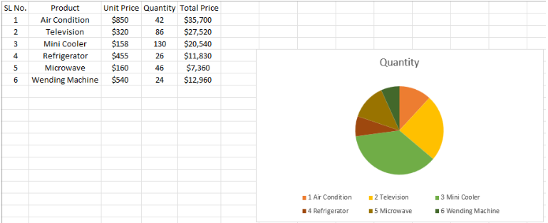
11. To view the status of the best-selling product, we can select the quantity to be displayed from the select data option.
12. The following chart represents the total quantity sold for each product during a monthly sale.
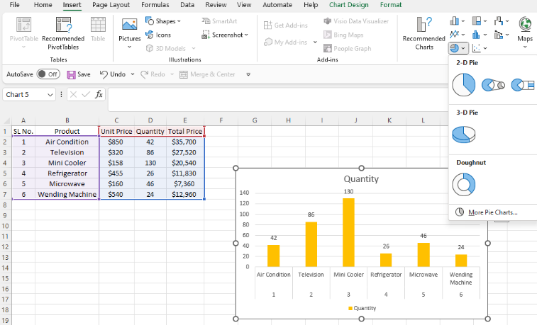
13. Users can make a pie chart showing which product was the best seller for a more visual representation. The user must click the Insert Pie or Doughnut Chart button for this. There are various options from this dropdown menu, including 2-D pie, 3-D, Doughnut, and More pie chart options.
14. For this example, the 2-D pie chart is selected, and the user can see a visual representation of your the in the form of a pie chart below:
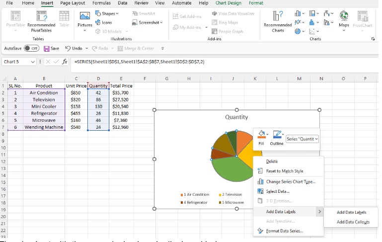
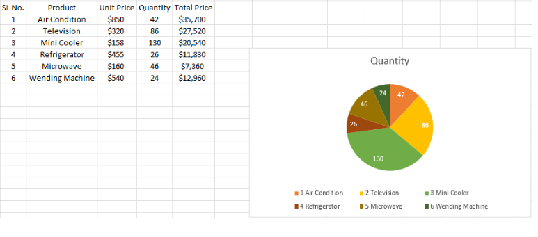
15. The user can edit the data and view numerical values on the pie chart. For this purpose, right-click on the chart and click the Add data labels option.
16. The pie chart with the numerical values is displayed below:
In a nutshell, users can create charts to display any data that is not easily readable. Forming the charts or graphs of such data helps make it easier for the potential audience to understand. Visual representation of the data helps profoundly in the decision-making of a business. The users can also choose from other charts to represent their databases on their specialty. For example, if the values across a few categories are required, the Column chart is a good option. The Line Chart is a good option if the representation for months or specific periods is required.
Similarly, the Area and Pie charts are best for indicating changes in data sets and quantifying the values to display percentages. The key advantage of any graph or chart is that it allows users to monitor the trends using data sets and statistical models. Most of the growing companies today use graphical representations to track their profit and loss and understand their customers’ needs to make important business decisions. Most industries like Economics, Marketing, IT, and Statistics use graphs to visualize the data.
About the Author
ByteScout Team of WritersByteScout has a team of professional writers proficient in different technical topics. We select the best writers to cover interesting and trending topics for our readers. We love developers and we hope our articles help you learn about programming and programmers.
1. What is Express.js? Express.js, or Express, is a back-end web application structure for Node.js, delivered as free and open-source programming under the MIT License....
Excel files or more commonly known as spreadsheets are used to store, manipulate, analyze and retrieve statistical data. Spreadsheets work as a down-featured version of database...