Our ByteScout SDK products are sunsetting as we focus on expanding new solutions.
Learn More
Important Update
ByteScout SDK Sunsetting Notice
Our ByteScout SDK products are sunsetting as we focus on our new & improved solutions.Thank you for being part of our journey, and we look forward to supporting you in this next chapter!
All You Need to Know About CSS Grid Layout: Introducing and Debugging
All You Need to Know About CSS Grid Layout: Introducing and Debugging
Cascading Style Sheets, usually known as CSS, is an essential piece of the advanced web development process. It is a very compelling HTML instrument that gives simple control over the format and introduction of web pages by separating content from design. In spite of the fact that CSS was introduced in the year 1996, it picked up standard ubiquity by the mid-2000s when prominent web browsers began supporting its features. The most recent variant, CSS3, has been available since 1998 and was last updated in the year 2008.
CSS is one of the “big three” languages of the world wide web. It’s utilized to style content, pictures, and other webpage components, and control their position on pages. It spares time since you can change the look of everything on your page—or only one component or segment—with a straight line of code. After you have aced HTML, CSS is the legitimate subsequent thing to learn. This post will explain to you the concept of the CSS grid layout framework.
What is the CSS Grid Layout?
CSS Grid Layout is a CSS technique intended for the two-dimensional design of things on a webpage or application. In short, CSS Grid Layout divides a web page into real parts or characterizing the relationship as far as size, position, and layer, between parts of a control built from HTML natives. Like tables, grid design empowers a creator to adjust components into sections and columns. In any case, numerous more formats are either conceivable or less demanding with the CSS grid than they were with tables. For instance, a grid container’s child components could position themselves so they really cover and layer, just like CSS positioned elements. Let’s look at the basic concepts of CSS grid layout.
Basic concepts
Grid Layout gives you a strategy for making grid structures that are portrayed in CSS and not in HTML. It encourages to make designs that can be reimagined utilizing Media Queries and adjust to various settings. CSS grid framework allows you to legitimately separate the order of components in the source from their visual introduction. Web designers and developers are allowed to change the area of page components as is best for the format of web pages. It’s anything but difficult to influence the grid to adjust to the accessible space. With every component having a territory on the grid, things are not in danger of covering because of content size change, more substance than anticipated, or little viewports. Dissimilar to an HTML table-based design, you can layer things on the grid. So one thing can cover another if required and because of this the webpages or websites remain mobile responsive.
Grid Terminology
Before jumping into the ideas of Grid it’s vital to understand the terminology. Since the terms involved in Grid framework are kinda reasonably similar, it’s anything but difficult to mistake them for each other in the event that you don’t first retain their implications characterized by the Grid specification. Following are grid terminologies
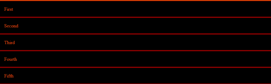
Grid Container
Grid containers comprise of grid items, set inside columns and rows. It’s the immediate parent of all the grid items. The below code will show you how to create a grid container. We create a grid container by using display: grid or display: inline-grid properties. Consider the following simple CSS layout example.
Step1. Open notepad and write below CSS and HTML code and save that file as grid.html
A grid container contains grid elements also known as grid items. Of course, a container has one grid element for each column, in each row/line, yet you can style the grid elements. The below code will tell you about grid Items.
Right now just read this code. Don’t try to visualize as there are CSS layout examples covered in this post later.
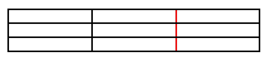
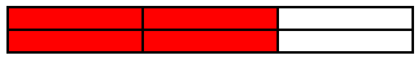
Grid Line
Gridlines are the isolating lines that make up the structure of the grid. They can be either vertical (“column grid lines”) or horizontal (“row grid lines”) and live on either side of a line or section. Here the red line is a case of a segment framework line. In the below figure, the red line is an example of a column grid line.
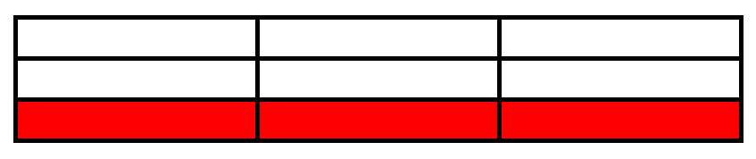
Grid Track
Grid track is the space between two nearby grid framework lines. You can consider them as the columns or rows of the grid. Here’s the framework track between the second and third-row grid lines. We create rows and columns on the grid with the grid-template-columns and grid-template-rows properties.
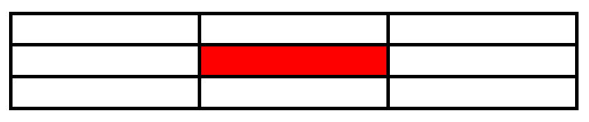
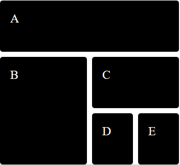
Grid cell
A grid cell is a space between two adjoining lines and two neighboring column grid lines. It’s a solitary “unit” of the Grid. The highlighted part in the blow figure is displaying us the grid cell.
Grid Area
The grid area is the total area covered by four grid lines. A grid area may be composed of any number of grid cells. The highlighted part in the below figure is displaying us the Grid area.
Now, that we understood grid terminology, let’s dig a little more into the details of the CSS grid layout with an example.
Basic grid example
In this example, we have defined a Grid by using display:grid or display:inline-gridon the parent item. We can also create a grid using the grid-template-columns and grid-template-rows properties. In this example, we have used the grid-gap property to create a gap between columns and rows of 10px.
From the above example, it is clear that the CSS Grid framework is an excellent layout system that enables any webpage to easily be divided into columns and rows. The entire concept of the Grid framework depends on its properties. The grid property is a short form of property for the following:
Grid-template-rows
Grid-template-columns
Grid-template-areas
Grid-auto-rows
Grid-auto-columns
Grid-auto-flow
Properties and Values of grids
There are various properties and to learn and understand CSS Grid Layout, one must first understand the values of all the properties, basic concepts, and terminology of CSS Grid Layout. Below is the table of different properties’ values and their description. The CSS Grid layout is complex. Not so since it is “troublesome” but rather the CSS Grid has new properties in addition to different ideas you’ve never known about anywhere else in CSS.
Value
Description
None
Default value. No sizing of the columns or rows
grid-template rows / grid-template-columns
Determines the size(s) of the rows and columns
grid-template-areas
Determines the grid layout using named items.
grid-template rows / grid-auto-columns
Determines the auto-size of the segments/columns and the size, height of the rows.
grid-auto-rows / grid-template-columns
Indicates the grid-template-columns property and auto-size of the rows.
The most effective method to put auto-placed things, and the auto-size of the rows, and sets the grid-template- property
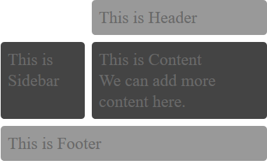
Header, Footer and Sidebar using grid
Now by using various properties and terminologies, we will create a grid layout that will display the header, footer, sidebar, and content.
HTML code
<div class="wrapper">
  <div class="box header">This is Header</div>
  <div class="box sidebar">This is Sidebar</div>
  <div class="box content">This is Content
	<br /> We can add more content here.</div>
  <div class="box footer">This is Footer</div>
</div>
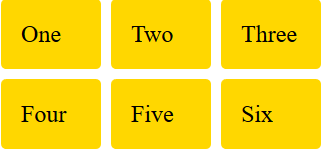
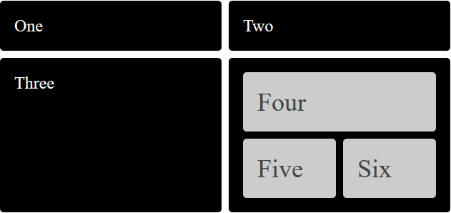
Now, let’s take a look at one more example. In this example, you will learn how to create a nested grid. Grid Area can become a grid, by setting display:grid and then define its rows and columns.
You can see from the above figure that grids “Four”, “Five”, ”Six” are known as nested grids.
Grid Debugging
The crucial step of website designing is endeavoring to see and picture websites or web pages in a clear manner while you are planning, or in the event that you are utilizing a current layout what you don’t see are your framework lines. Ther are many CSS debugging tools. In short, if you are using browsers like Mozilla Firefox and Google chrome then there are some tools with the help of which one can debug the grid layout. For Mozilla, there are some DevTools like Grid Inspector which comes into use. Getting started with Grid debugging is simple. You simply characterize a container component like a grid with display: grid, set the section and row sizes with grid layout segments and grid template rows, and afterward put its child components into the grid with grid-columns and grid-row.
If you right-click and go to inspect element section, you will first run over the OverLay Grid. This will demonstrate to all of you the components on the page. The show: grid will consequently be connected. When you go to the layout tab, by default there will be one grid showed. In this manner, you can inspect each and every component present in the container and can adjust their settings. This Grid inspector tool also shows the CSS properties that are responsible for the position, size, and geometry of the selected component/element, such as box-sizing, display, float, line-height, position, and z-index.
About the Author
ByteScout Team of WritersByteScout has a team of professional writers proficient in different technical topics. We select the best writers to cover interesting and trending topics for our readers. We love developers and we hope our articles help you learn about programming and programmers.

 Important Update