Our ByteScout SDK products are sunsetting as we focus on expanding new solutions.
Learn More
Important Update
ByteScout SDK Sunsetting Notice
Our ByteScout SDK products are sunsetting as we focus on our new & improved solutions.Thank you for being part of our journey, and we look forward to supporting you in this next chapter!
Plotting Geographical Heatmaps using Python Folium Library
Plotting Geographical Heatmaps using Python Folium Library
In this article, you will see how to plot geographical heatmaps with the help of the Python Folium library. The Folium library is a data visualization library that you can use to plot various types of geographical maps, including the heatmap.
Installation Folium
You can install the Folium library via the following pip command:
pip install folium
If you are running Anaconda’s Python distribution, you can install the Folium library via the following command:
conda install -c conda-forge folium
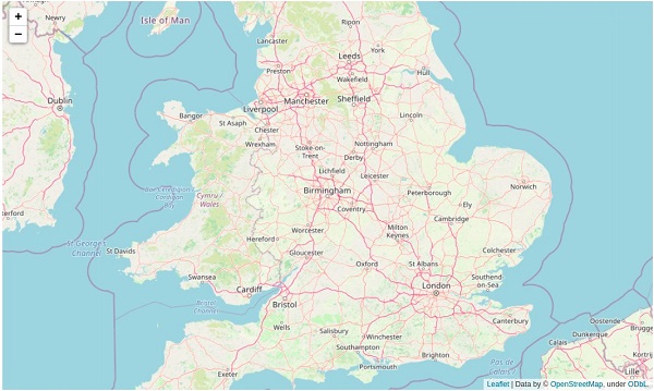
Plotting a Simple Map
Let’s first see how you can plot a simple map using the Folium library.
Look at the following script.
The first step is to import the folium library. Next, you have to create an object of the Map class.
The latitude and longitude values used to center the map are passed inside a list to the location attribute of the Map class object.
The zoom value is passed to the zoom_start attribute. Pass smaller values to zoom in and greater values to zoom out.
Finally, you can save the map in the form of an HTML document using the save() method. If you are using a Jupyter Notebook, you can display the Map directly via the Map object name.
Since we passed the coordinates of Birmingham (a city in England) to the location attribute of the Map object, the above map is centered in Birmingham.
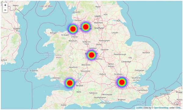
Plotting a Heatmap With Folium
Let’s now see how to plot a Heatmap with Folium. To do so, you have to import the HeatMap object from the folium.plugins module.
Next, you need to create a list of lists where each inner list contains latitude and longitude coordinates of the location that you want to plot on your heatmap.
In the script below, we create a list of lists that contains coordinates of five English cities (London, Manchester, Liverpool, Birmingham, and Cardiff).
The list of coordinates is passed to the HeatMap class constructor. The add_to() method is called on the HeatMap class and the map object on which you want to plot the heatmap is passed to it.
Look at the following script for reference.
from folium.plugins import HeatMap

lat_longs = [
    [51.507351, -0.127758], # london
    [53.480759, -2.242631], # Manchester
    [53.408371, -2.991573], # Liverpool
    [52.489471, -1.898575], # Birmingham
    [51.481583, -3.179090], #Cardif
]

HeatMap(lat_longs).add_to(map_object)

map_object
Output
In the above output, you can see the heatmap containing spots for England’s five cities.
By default, the color of all the spots in the heatmap remains the same if the coordinates in the heatmap have the same number of occurrences.
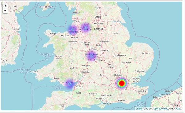
Let’s see what happens when some locations appear more often than others. For instance, in the script below, the coordinates for London appear twice in our list of coordinates.
In the output, you will see that the spot for London in the heatmap will have a higher intensity than the others.
By default, the gradient values for color spots in the heatmap range from blue to red for the locations occurring less frequently, to locations occurring more frequently, respectively.
import folium

map_object = folium.Map(location = [52.489471, -1.898575], zoom_start = 7 )

from folium.plugins import HeatMap

lat_longs = [
    [51.507351, -0.127758], # london
    [51.507351, -0.127758], # london
    [53.480759, -2.242631], # Manchester
    [53.408371, -2.991573], # Liverpool
    [52.489471, -1.898575], # Birmingham
    [51.481583, -3.179090], #Cardif
]

HeatMap(lat_longs).add_to(map_object)

map_object
Output
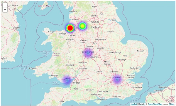
Plotting a Weighted Heatmap
You can also pass weight values for the spots on your heatmap. The weight values are passed as the third parameter after latitude and longitude values for the location.
Look at the script below for reference. Since coordinates for all the locations appear only once in our list of coordinates, and the weight value for the city Liverpool is the highest, the spot for the city Liverpool will have the highest intensity in the heatmap.
In this section, you will see a real-world example of plotting heatmaps with the Folium library. You will see how you can plot a heatmap that shows the number of Covid-19 cases in different US states.
The dataset for this section can be downloaded from this Kaggle Link.
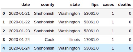
The following script imports the dataset and displays its first five rows using the Python Pandas Library.
import pandas as pd

covid_data = pd.read_csv("/home/manimalik/Datasets/us_counties_covid19_daily.csv")
covid_data.head()
Output
From the output, you can see that the dataset contains 6 columns. We are interested in the “state” and “cases” columns.
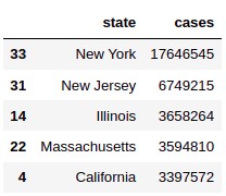
The dataset contains daily covid cases from 21st January 2020 to 31st May 2020. We want the sum of the number of Covid-19 cases during this period for all the states.
To do so, you can use the GroupBy function from the Pandas data frame. The following script groups the number of Covid-19 by state, and sorts the result in descending order.
From the output above, you can see that Newyork, New Jersey, and Illinois have the highest number of Covid-19 cases. Let’s see how we can plot this information on a heatmap using Folium.
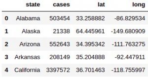
We have state names, however, we need latitude and longitude coordinates for these states. You can use the Nominatim module from the Python Geopy library to get latitude and longitude values from location names.
The script below defines the get_loc_coordinate() function that takes a location name as a parameter and returns the latitude and longitude names for that location.
Next, we use the progress_apply() function to pass the values from the state column of our Pandas data frame to the get_loc_coordinate() function. The resultant latitude and longitude values are stored in the newly created lat and long columns of the Pandas data frame.
From the above output, you can see that our data frame now contains state names, the number of cases, and latitude and longitude coordinates for the states.
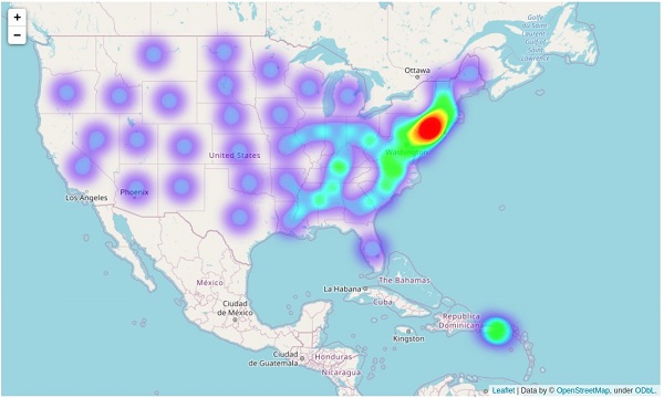
Next, we will create a list of lists where each inner list contains latitude and longitude coordinates. The number of cases is used to define the weight values.
Finally, the list of lists containing the latitude, longitude, and weight values for the number of cases are passed to the HeatMap class, which is then added to the base folium Map class object.
As expected, from the above output you can see that the intensity of the heatmap is higher near New York and New Jersey, signifying a higher number of covid cases in these areas.
About the Author
ByteScout Team of WritersByteScout has a team of professional writers proficient in different technical topics. We select the best writers to cover interesting and trending topics for our readers. We love developers and we hope our articles help you learn about programming and programmers.
People have always tried to find new ways to make advancements in the world of web development. Making web development easier will allow developers to...
Like many other rules, the rules of traveling also constantly change. Airlines don't usually specify the classifications of bags that travelers may take as carry-ons....